Can you imagine life without colours? The world would be so dull and boring without colours. Do you know that each colour has a story to tell? Whether you are buying clothes or you want to choose colours for your walls or window treatments, you need to understand what each colour has for you.
You might want to experiment with the colours of your walls, curtains, or blinds, but you need to learn what each colour brings to the table.
When you know what effects colours bring to your home and how they affect your mood, you will be able to choose the right colours for any of your applications.
Do you know why some colours bring joy and happiness the moment you look at them? On the other hand, some colours make you feel drowsy. Yes, each colour has its own story to tell. All you need is for your ears to function.
In this post, we will discuss eight primary interior colours and how these colours can affect your mood. Let’s get started!
Eight primary interior colours and how these colours can affect your mood.
White
Most of us will say that white brings peace, tranquilly, and calmness to our lives. However, there are other things that you need to know. When you paint your walls white or off-white, you can make your home feel more spacious and neutral. Furthermore, white also makes space look more clean, neat, and energetic. Choosing this colour will make everything inspiring and peaceful, whether it is the wall colour, clothes, or anything else.
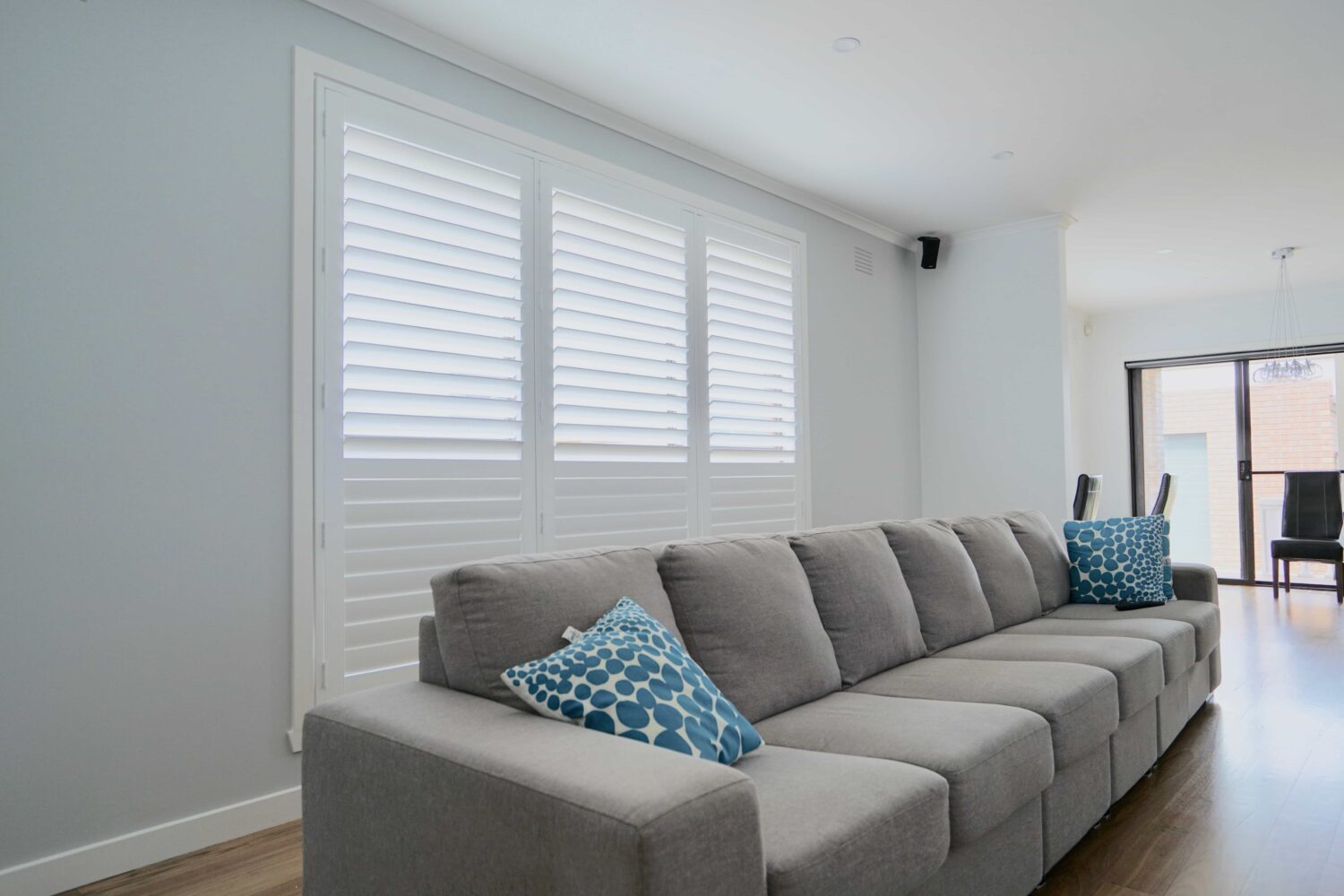
In addition to that, white spaces also stand for protection, innocence, and goodness. When you have white curtains online or plantation shutters melbourne, it will make the room look more spacious, vibrant, and radiant. It will also create the illusion that the ceiling is higher and the room is bigger than it is. White has the magic to transform your space into a spacious and miraculously pure one.
Blue
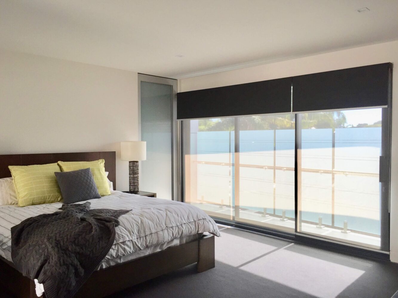
Blue is one of the preferred choices for bedroom or living room walls and modern curtains. Experts recommend this colour for window treatments as it causes the body to create some chemicals that make you feel calm and peaceful. Also, blue evokes feelings of spirituality and trust. When you are designing your office, going for dark blues will make the space more professional and sophisticated. Light blues will give a more relaxing and friendly look to your room. Facebook and Twitter are great examples of using lighter blues.
You will be astonished by the serenity and calmness blue brings to your life. Medically, blue might get your blood pressure down and can help steady your breathing process. Pastel blues can make the room more cold and chilly, and light, warm blues can match with any type of décor and furnishing.
Grey
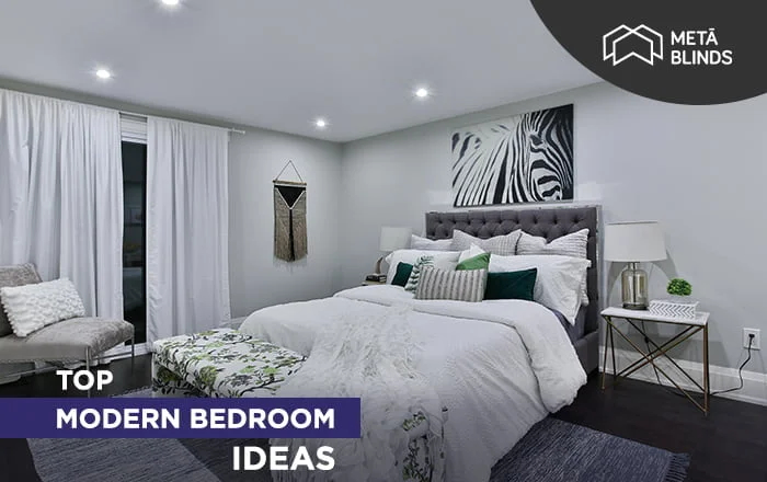
The most favourite choice for bedrooms among homeowners is the stunning colour grey. They make the whole environment more clean and open. Muted and pale greys can help you create a calming space and also make a room more spacious and beautiful. If you are having sleeping difficulties, you can go for grey walls in your bedroom to have peace and balance.
Furthermore, grey shows maturity and responsibility. It throws positive vibes with formality and dependability. It is serious, reserved, and subdued. When you go for a lighter grey shade, it will make the room feel calm and serene. On the other hand, darker shades will give you a more masculine and professional look.
Brown
Brown is another neutral colour that can make a bold statement when used in a home interior. Brown makes the environment full of calmness and steadiness. It is a symbol of peace and solitude and also shows practicality and creativity. Brown also brings stability, reliability, and orderliness.
Brown can be used in the living room and dining room and can also be used in the office or creative areas where you want wholeness. It also shows support, warmness, and practicality. It can match with any type of classic or contemporary home décor and will look amazingly well and be dependable.
Yellow
Yellow is the warmest and most vibrant colour that can be used in kitchens and other areas of the home or office. Yellow brightens the mood and also makes you feel energetic and going. Also, it is a colour of joy and liveliness when it catches direct sunlight. Yellow is the synonym of laughter, hope, and sunshine and can keep you high throughout the day.
You will feel cheerful, energetic, and optimistic, which will give you more motivation to do things. However, you need to understand that yellow might irritate your eyes as it reflects more light. Using too much yellow is not recommended. Though it is a comforting and joyful colour, don’t use it too much in your home or office.
Red
Red is not just about roses and romance. Also, red is not just about hostility and rage. For some individuals, red might be the colour to avoid any type of pplication. Medically, red might raise your blood pressure and heartbeat and be responsible for mood swings and irritability.
However, red also symbolises excitement, enthusiasm, and energy. Red is a colour of passion, power, luck, and confidence. It is also a colour for socialising and creativity. It reflects friendliness, sociability, and assertiveness, as well as safety, protection, and warmth. Most of the time, red is used in social rooms and not in spaces that are meant to be calm and relaxing.
Pink
Pink is, most of the time, considered a feminine colour, and there is nothing wrong with it, thanks to the vast dating market. However, pink has a calming effect on the nerves, and you can feel more relaxed, less aggressive, and less angry when you are surrounded by this colour.
It has the opposite effect on its primary red colour. If you want to decorate your kid’s room, lighter pinks would be a great choice. It promotes a feeling of care, love, kindness, and playfulness. Also, pink reflects romance, femininity, tenderness, and sweetness. It is a charming colour that can make you romantic and tender.
Orange
If you are looking for a colour that is synonymous with excitement, orange is the name. However, home decorators don’t find orange an ideal colour to be used in living rooms and bedrooms due to its overexciting effect. Orange brings energy, enthusiasm, and excitement to space and is the best colour for exercising areas.
Also, experts suggest that oranges can stimulate your appetite, and hence, you can think about whether to use them in the kitchen or not. If you are on a diet and calorie-conscious, using oranges in your kitchen is not a good idea.
Conclusion
I hope you know the feelings and emotions associated with each colour you choose for your home. Understanding these colours and emotions will also help you make the right colour combination for your bedroom walls, kitchen walls, window treatments, and others.
Related Articles
Discover the perfect blinds for your home: Continue your journey through our comprehensive guides & related reads.